
SFCにAlumniが帰ってきた!―2025年度OBOG交流会
2025年7月16日
読了時間: 1分
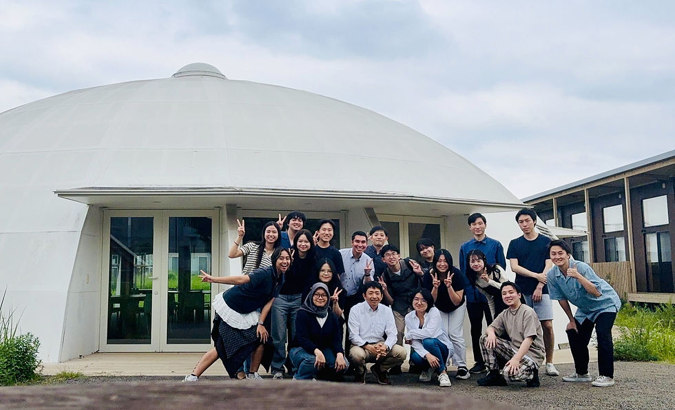
2025年7月、篠原研究会を卒業されたOBOGの皆さんが、久しぶりにSFCに帰ってきてくださいました!
篠原研究会では、毎年春学期にOBOG交流会(Alumni Meeting)を開催しています。このイベントは、世代を超えてつながりを深める、研究会にとって大切な恒例行事です。
交流会は、なんと料理づくりからスタート!
ひとつのコミュニティとして、研究会生全員が協力して料理をつくります。それぞれの個性や出身地を活かした多種多様なメニューが並びました。
食卓に並んだ料理は、まるで研究会の多様性そのものを映し出すようです。

午後は、自己紹介をしながら交流タイム。
現役生・OBOGが一緒に料理を味わったり、グループゲームで盛り上がったりと、会場は終始和やかな雰囲気に包まれました。
卒業生の自己紹介では、行政学の理論を織り交ぜながら、今の仕事をどのように実践に活かしているのか、また考えられる問題は何かを語ってくださりました。行政という分野への新たな視点を得る貴重な機会となりました。
これからも、世代を超えてつながる場として、このAlumni Meetingを大切にしていきたいと思います。
また次回、お会いできる日を楽しみにしています!


I noticed someone talking about https://www.0eejl.com/ online, so I decided to visit the site and see it for myself. I only browsed around for a short time, paying attention mainly to the interface and the overall content arrangement. My initial impression was that the design looked simple and well organized, so it did not feel confusing or overloaded. I was not planning to explore the platform deeply during that visit, and I soon returned to reading the comments. With more free time, I may come back for a closer look.
eejl com Mình có thử truy cập vào trang này sau khi thấy nó được nhắc đến ở một số nơi trên mạng, mục đích chủ yếu là xem cách họ thiết kế giao diện và sắp xếp nội dung. Do chỉ xem lướt nhanh nên chưa tìm hiểu sâu, nhưng có thể thấy bố cục khá hợp lý, tổng thể không bị rối mắt. Các phần thông tin hiển thị rõ ràng, được sắp xếp khoa học nên khá dễ theo dõi. Khi mở trên điện thoại, trang vẫn hoạt động ổn định và thao tác tương đối mượt. Nhìn chung mang lại cảm giác đơn giản và dễ dùng.
I had not paid much attention to https://www.33bd33.com/ before, but one day I happened to come across the name and decided to visit for a quick look. I mainly focused on the overall layout rather than checking every function in detail. The content is divided into several clear areas, and the headings are easy to recognize while scrolling. On a phone, the page also looks fairly neat, without making the text feel crowded. For me, the interface is the most noticeable part.
Mình lướt qua mm886 do thấy bạn bè nhắc, chủ yếu tò mò xem họ bố cục trang ra sao thôi. Vào trang thấy tiêu đề đặt khá nổi, đọc vài dòng là biết họ đang nói về một thương hiệu giải trí kiểu tổng quan, không phải dạng bắt bấm nhiều mới hiểu. Mình không đào sâu, chỉ kéo xuống xem cách trình bày: nội dung chia theo từng khối nhìn gọn, đoạn văn ngắt hợp lý nên mắt đỡ mệt. Có mấy heading làm điểm nhấn nên tìm ý chính nhanh, kiểu đọc lướt vẫn nắm được. Nói chung cảm giác dễ chịu, không bị nhồi chữ, và phần tiêu đề/khối thông tin được sắp xếp theo từng…
Khi đang tìm một số nội dung tham khảo, mình bắt gặp https://gg88n2.com/ nên đã mở trang để xem qua cách trình bày. Mình chỉ quan sát tổng thể và chú ý đến cách họ phân chia từng nhóm thông tin. Nhìn lần đầu, mình thấy bố cục khá sạch và thoáng, các chuyên mục được sắp xếp thành từng phần tương đối rõ nên dễ theo dõi. Phần tiêu đề cũng được làm nổi bật vừa phải, thuận tiện khi kéo xuống xem tiếp.